
NBA TRENDING BONUS* NBA "CITY EDITION" JERSEY REVIEWS
 |
| (photo from sportingnews.com) |
This year Nike started it's first season of an 8 year contract supplying the official jerseys for the NBA. The new jerseys debuted the first night of the season, and besides the rate of unusually tearing (Youtube clip), have received a lot of love from NBA fans. Nike also worked with the teams to create another special edition jersey for each team titled the "NBA City" jerseys. The Jerseys were made to reflect the history and culture of each of the cities, and most of them have a lot of meaning behind the designs. Before we see these jerseys on the court, let's take a peek, and preview each team's new look using our Trending Chart.


Atlanta Hawks

Atlanta has pushed the neon thing before, but this time it actually makes sense. The pattern isn't too overdone and the neon fits in much better with black.
Boston Celtics

The grey is a little boring. It's really similar to the normal Celtics jersey, but if you look super closely, the pattern is quite interesting.
Brooklyn Nets

Brooklyn played it safe, but I do like it. The bridged name and the light white streaks give this jersey one very sleek look.
Charlotte Hornets

The colors are super dope and the lettering is awesome. A+Job here.
Chicago Bulls

Overall clean jersey. It's hard to get creative as the Chicago Bulls, so a good safe decision that I mostly like.
Cleveland Cavaliers

This one is puzzling. The yellow is really bad, and "The Land" doesn't do much at all for me.
Dallas Mavericks

The colors were an interesting choice, and it almost paid off. "DAL" Looks strange and the lines seem kind of misplaced.
Denver Nuggets

Super great jersey. The logo is similar to their white sleeved jerseys, but looks so much better with the Nugget's colors.
Detroit Pistons

Kinda generic. It's close, but leaves me wanting more. The Name definitely looks a few font sizes too small.
Golden State Warriors

The Warriors really gambled and lost on this look. The teal color on the shorts and the circle logo are just too out of place.
Houston Rockets
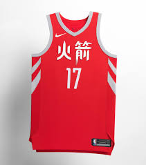
I don't hate this jersey as much as I'm disappointed. We've basically seen this jersey from the rockets, and I have zero excitement here.
Indiana Pacers

This feels like 2 different ideas forced together. It's definitely throwing me off to have the full length racing stripe and then the random circle around the number.
Los Angeles Clippers

I was close to moving this up, but barely hesitated. This jersey is super fun, and I almost wish these were the Clippers primary colors.
Los Angeles Lakers

I mostly liked this at first glance, but after noticing the Mamba pattern, I had no other choice...
Memphis Grizzlies

Pretty simple but one of the coolest stories behind it. These were designed after the 1968 Memphis Sanitation workers strike. Great job guys.
Miami Heat

This jersey hasn't been officially released but it SCREAMS Miami, I love love love this.
Milwaukee Bucks

The cream color is just so unique. It almost feels like it belongs in their actual color scheme
Minnesota Timberwolves

Probably my favorite of the grey jerseys, and it's going to look awesome on the court. That being said,the design on the side might not look too flattering when worn by some fans...
New Orleans Pelicans

The Mardi Gras look has been done plenty before, and this one has the worst Name/Number combo for sure.
New York Knicks

I can't wait for the Knicks to debut these. The NYC Firefighter inspiration is fantastic, and suits this current Knick team vibe very well.
Oklahoma City Thunder

Yikes these are bad. The grey fading is weird, and everything on the jersey looks just sloppy.
Orlando Magic

This has a YMCA youth basketball look, and I'm not at all digging the outer space splatter design. Probably my least favorite "City" jersey.
Phoenix Suns

This jersey design is actually pretty clean, but the purple top and shorts are way too much in the wrong direction.
Philadelphia 76ers

The name font is just perfect, and it fits right in with the 76ers other Jerseys.
Portland Trailblazers

The checkered pattern is really nice, but forgettable. It's a name they've used and colors they regularly use, but it should still look good on the court.
Sacramento Kings

This was soooo close to actually being awesome. I love the logo and color, but the white part is just weird and kinda looks like a tank top/sports bra.
San Antonio Spurs

The Military inspiration is cool, but that's about it. Nothing too surprising out of San Antonio here.
Toronto Raptors

I love the black and gold color scheme for Toronto. The only weird thing is "North" going up and down, my eyes don't seem to like trying to read it.
Utah Jazz

I just have no idea what to think about this one. With the shorts it looks even more odd. Maybe on the court the full team will look good??? Maybe?
Washington Wizards

Seeing the District of Columbia is different, but pretty cool. Most white jerseys look solid and this one should as well.
Images from Nike.com, Sbnation.com, oregonlive.com, sneakernews.com, and hardwordventures.com


Comments
Post a Comment